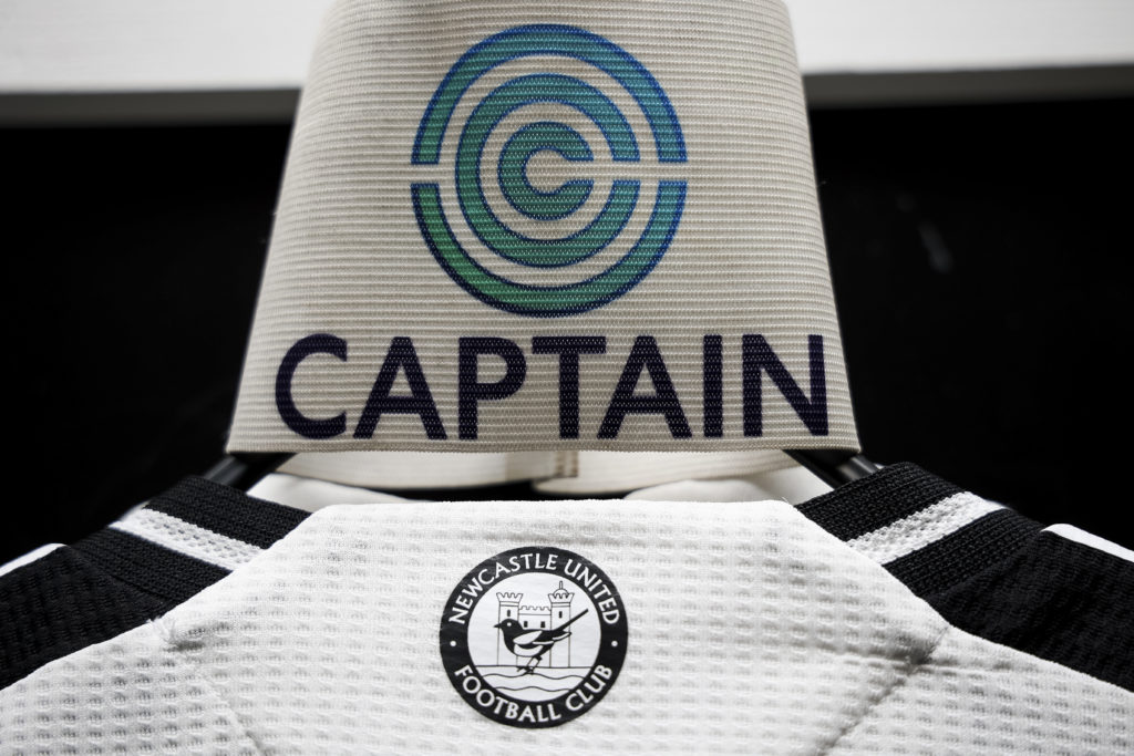
Newcastle United have dropped the bombshell that they plan to change the club’s iconic badge.
It’s been a great season for Newcastle United after the 70-year wait for a trophy was finally brought to an end by winning the Carabao Cup but Toon fans are not celebrating wildly at this news.
Newcastle released a lengthy statement on Friday announcing that the club plans to ‘update’, ‘refine’ and ‘revive’ the club’s famous badge.
The club crest has been on the front of Newcastle shirts since 1988 but the club has justified its decision by claiming its ‘intricate design doesn’t always translate well in today’s digital world.’
Newcastle have taken steps to try and avoid the backlash that befell clubs like Everton and Leeds United, who announced hated new crests and were forced to abandon them amid fan pressure.
After already speaking to the Fan Advisory Board, the club wants season ticket holders and members to share their thoughts on what needs to be changed and what should remain on a new look badge in a survey. A workshop will also be held at St. James’ Park.
An initial consultation will last a week before entering a second stage. Eventually, the Chronicle reports, there will be a fan vote held on three different designs, but none of them will be the current badge.
Though the news will come as a shock to supporters – who Eddie Howe has just called to help his side against Chelsea on Sunday – it is not the first time Newcastle have changed their crest.
Newcastle United’s coat of arms crest – 1969-1976
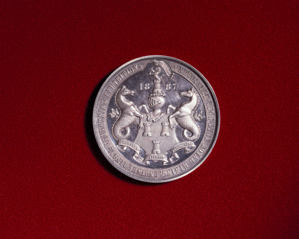
As difficult as it is to believe, a badge didn’t actually adorn a Newcastle shirt until 1969 when the club adopted the city’s coat of arms to the kit.
The coat of arms bears a resemblance to the current crest as it has a similar shape with seahorses flanking either side, but it is mostly red in colour, features a bigger shield and the city’s Latin motto in a banner.
The Magpie badge – 1976-1983
Round badges are all the range these days due to their simplicity, making them easy to replicate and snugly fit into social media profile pictures.
MK Dons became the latest to change their badge to a circle just last week, but the likes of Manchester City, Brentford, Bristol City, Inter Miami, New York City and a never-ending list of clubs all have the same homogenised style.
Fans are concerned that Newcastle will now head in the same direction but the club actually had a surprisingly modern badge between 1976-1983.
This was Newcastle’s first badge specifically designed to be worn on a kit and featured a magpie, the River Tyne and the historic keep with the club’s name.
A return to something similar might actually go down well.
NUFC design – 1983-1988
The badge was changed again in 1983 for an even simpler design, something the club must wish they still had today.
It simply contained the club’s initials, ‘NUFC’, with the C turned over and a tiny magpie perched below it.
Though the badge was short-lived and discontinued five years later, it has seen a resurgence in recent years and features on this season’s third shirt.
Could this be the club’s new badge again going forward?
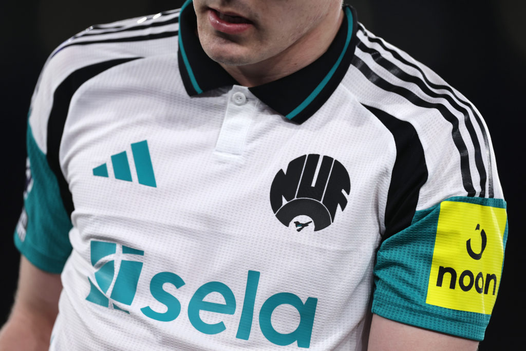
The current design – 1988-?

Newcastle adapted the badge that has become so iconic today in 1988, with so many supporters knowing nothing else in the 37 years since.
The famous crest was worn throughout the historic eras of Kevin Keegan and Sir Bobby Robson and was worn when the club finally won a trophy again by defeating Liverpool in the Carabao Cup final.
It features the seahorses from the coat of arms, reflecting Newcastle’s long connection with the sea, as well as the keep and black and white stripes.
But it looks like it won’t be on the shirt for much longer.
Receive a digest of our best Newcastle content each week direct to your mailbox